
 A long post, in which you’ll have to slog or scroll through several paragraphs to get to the real question: can we navigate using fallen sticks?
These days we seem to be inundated with deeply flawed scientific papers, often featuring shaky conclusions boldly drawn from noisy data, results that can’t be replicated, or both. I was reminded of this several times over the past few days: (i) A group published an impressive large-scale attempt to replicate the findings reported in 100 recent psychology studies , recovering the “significant” findings of the original papers only about a third of the time [1]. (ii) A colleague sent me a link to an appalling paper claiming to uncover epigenetic signatures of trauma among Holocaust survivors; it pins major conclusions on noisy data from small numbers of people, with the added benefit of lots of freedom in data analysis methods. Of course, it attracted the popular press. (iii) I learned from Andrew Gelman’s blog, where it was roundly criticized, of a silly study involving the discovery that “sadness impaired color perception along the blue-yellow color axis” (i.e. feeling “blue” alters your perception of the color blue). (The post is worth reading.)
Of course, doing science is extremely difficult, and it’s easy to make mistakes. (I’ve certainly made large ones, and will undoubtedly make more in the future.) What seems to characterize many of the sorts of studies exemplified above, though, is not technical errors or experimental mis-steps, but a more profound lack of understanding of what data are, and how we can gain insights from measurements.
Responding to a statement on Andrew Gelman’s blog, “Nowhere does [the author] consider [the possibility] that the original study was capitalizing on chance and in fact never represented any general pattern in any population,” I wrote:
I’m very often struck by this when reading terrible papers. … Don’t people realize that noise exists? After asking myself this a lot, I’ve concluded that the answer is no, at least at the intuitive level that is necessary to do meaningful science. This points to a failure in how we train students in the sciences. (Or at least, the not-very-quantitative sciences, which actually are quantitative, though students don’t want to hear that.)
If I measured the angle that ten twigs on the sidewalk make with North, plot this versus the length of the twigs, and fit a line to it, I wouldn’t get a slope of zero. This is obvious, but I increasingly suspect that it isn’t obvious to many people. What’s worse, if I have some “theory” of twig orientation versus length, and some freedom to pick how many twigs I examine, and some more freedom to prune (sorry) outliers, I’m pretty sure I can show that this slope is “significantly different” from zero. I suspect that most of the people we rail against in this blog have never done an exercise like this, and have also never done the sort of quantitative lab exercises that one does repeatedly in the “hard” sciences, and hence they never absorb an intuition for noise, sample sizes, etc. (Feel free to correct me if you disagree.) This “sense” should be a prerequisite for adopting any statistical toolkit. If it isn’t, delusion and nonsense are the result.
It occurred to me that it would be fun to actually try this! (The twig experiment, that is.) So my six-year-old son and I wandered the backyard and measured the length and orientation of twigs on the ground. I couldn’t really give a good answer to his question of why we were doing this; I said I wanted to make a graph, and since I’m always making graphs, this satisfied him. This was a nicely blind study — he selected the twigs, so we weren’t influenced by preconceptions of the results I might want to find. We investigated 10 sticks.
Here’s a typical photo:
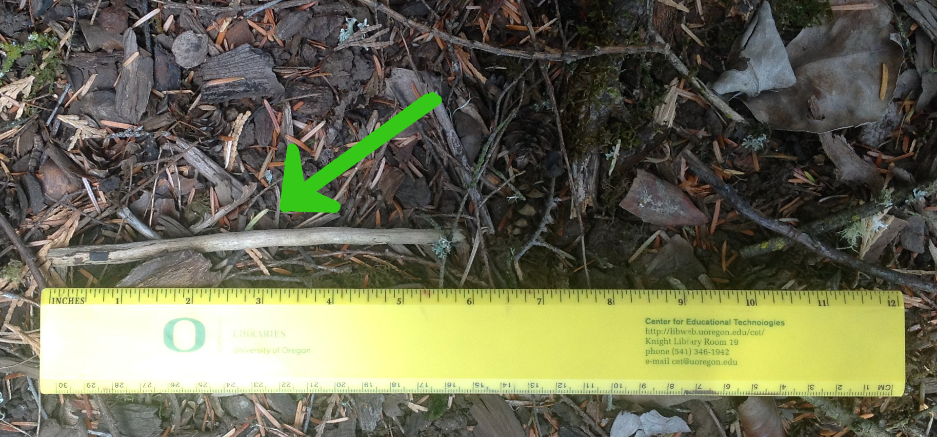 This particular twig points about 70 degrees west of North (i.e. it lies along 110- 290 degrees).
What’s the relationship between the orientation of a twig and its length? Here’s the graph, with all angles in the range [-90,90] degrees, with 0 being North:
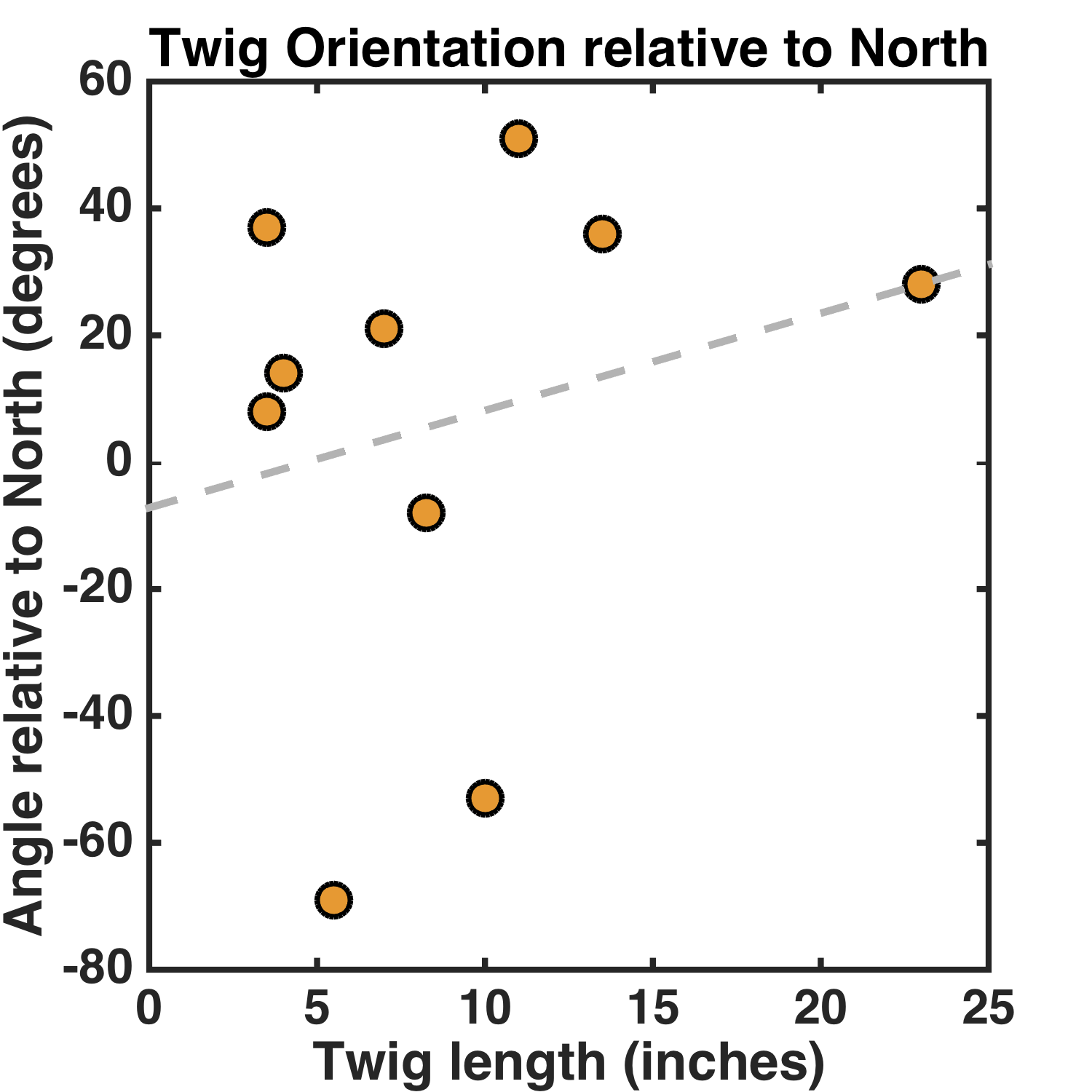 The slope isn’t zero, but rather 1.5 ± 2.3 degrees/inch. (It’s almost unchanged with the longest stick removed, by the way.)
The choice of North as the reference angle is arbitrary — perhaps instead of asking if the shorter or longer sticks differentially prefer NW/SE vs NE/SW, as this analysis does, I should pick a different reference angle. Perhaps a 45 degree reference angle would be sensible, since N/S and E/W orientations are nicely mapped onto positive and negative orientation values. Or perhaps I should account for the 15 degree difference between magnetic and true North in Oregon. Let’s pick a -65 degree reference angle (i.e. measuring the twig orientation relative to a direction 65 degrees West of North). Here’s the graph:
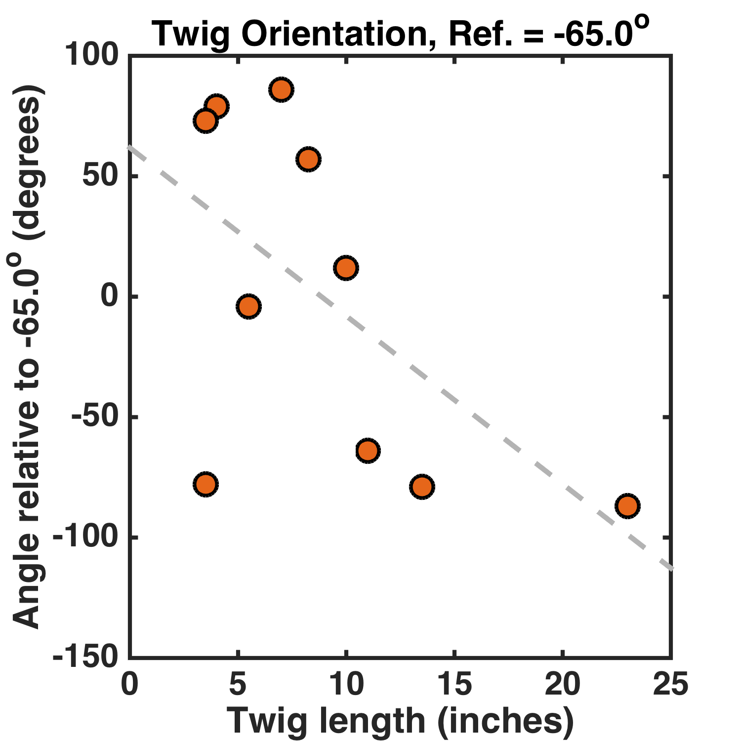 Great! Now the slope is -7.0 ± 3.4 degrees/inch. The p-value* is 0.01.** I didn’t even have to eliminate data points, or collect more until the relationship became “significant.”
Clearly the data indicate a deep and previously undiscovered relationship between the length of twigs and the orientation they adopt relative to the geographic landscape, perhaps indicating a magnetic character to wood that couples to the local magnetic and gravitational fields. Or that’s all utter nonsense.
Having done this, I’m now even more convinced that analyzing “noise” is an entertaining thing to do — it would make a great exercise in a statistics class, coupled with an essay-type assignment examining its procedures and outcomes.
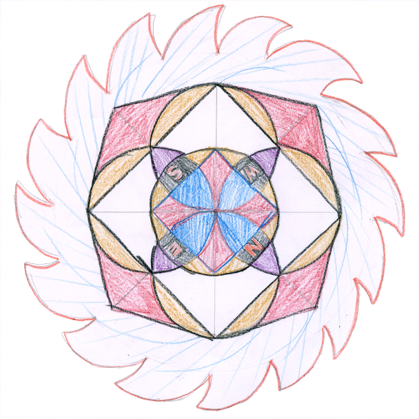
Today’s illustration (at the top of the post) isn’t mine; it’s by my 10-year-old, and it coincidentally shows the cardinal directions. (We’ve been playing around a bit with compass-and-ruler drawings.)
* I find it hard to understand how one makes a p-value for a linear regression slope. I did it by brute force, simulating data drawn from a null relationship between orientation and length and counting the fraction of instances with a slope greater than the observed value.
** The astute reader asks, “shouldn’t you apply some sort of multiple comparisons test?” Sure, but how many comparisons did I make?
[1] Open Science Collaboration, Estimating the reproducibility of psychological. Science. 349, aac4716 (2015). http://www.sciencemag.org/content/349/6251/aac4716

So do dogs not really orient to north to poop? It was just noise? Or do they survey twigs in their vicinity, find a slope based on their preconceived notion that twigs orient to north, and orient to the twigs after finding a collection that show some orientation towards north? Or do they listen to the C. elegans in the soil trying to orient to some cone projecting up and take an orthogonal of that?
The thought of worms and your post on replication made me think of a paper published long ago that I have used in quarterly exams as an example (I can’t remember if I’ve already gone on about this or not to you).
The paper is: DAF-16 Target Genes That Control C. elegans Life-Span and Metabolism
http://www.ncbi.nlm.nih.gov/pubmed/12690206 , published in Science.
They look for DAF-16 (a transcription factor) binding sites in C. elegans, and then use the idea that orthologous genes in fly and C. briggsae that also have the motif are more likely to be real targets since those motifs have been retained over time.
One section that seems problematic:
“We surveyed 1 kb upstream of the predicted ATG of 17,085 C. elegans and 14,148 Drosophila genes and identified 947 C. elegans and 1760 Drosophila genes that contain at least one perfect-match consensus DAF-16 binding site within the 1-kb promoter region. We then compared these DAF-16 binding site–containing worm and fly genes with a list of 3283 C. elegans and Drosophila genes that are orthologous to each other, and identified 17 genes that are orthologous between Drosophila and C. elegans and bear a DAF-16 binding site within 1 kb of their start codons in both species (Table 1).”
They found 947/17,085 C. elegans genes had the site, and 1760/14,148 fly genes had the site. By chance, you would expect 947/17,085 x 1760/14,148 = 0.00682 of the resulting genes to have it in both fly and worm, right? 0.00682 of 3283 orthologues = 22, so they found fewer than you would expect by chance, and yet this cross-species screening is the basis for their selecting the genes for further study and considered validation that these are true targets.
Next, in Table 1, they showed that these 17 genes that had sites in fly and worm also had sites in briggsae. But the bottom of the table has this note:
“† These binding sites contain one mismatch from the consensus that retains DAF-16 binding in vitro.”
Now, the binding site TTGTTTAC and the reverse complement might be expected to appear every 15 kb given a GC content of 33%. Add some variant mismatch motifs allowed (from their reference it looks like they allowed 6 alternate sequences, so 7 in total) and you would expect to see a variant in half of the 1 kb regions. When they didn’t find a motif, or a mismatch motif in the 1 kb region, they expanded it to 2.7 kb and found motifs in all the targets. Again, with 7 motifs allowed and each motif occurring every 15 kb, 2.7 kb is not a useful filter as most genes should have a motif since 15 kb/7 = 2.14 kb.
Later, they increase the search space for worm by 50% and fly by 5-fold, and increase the target set of genes by 66. The new probabilities would be 0.0825 x .62 = .05, so .05 x 3283 = 167 genes predicted by chance, so worse than expected by chance alone again.
Despite choosing a cross-species probability method that apparently would have no power in finding true targets, and mixing in degenerate motifs when needed that also had little power and then expanding the target range without any calculation on how this would affect the number of targets, this became a Science paper!
Thanks for writing all this — interesting! No, I don’t think you mentioned this paper before. In the first part, it seems to use the same avoidance of multiplying probabilities as the paper we were chatting about a few weeks ago:
M. Kellis, B.W. Birren and E.S. Lander, Proof and evolutionary analysis of ancient genome duplication in the yeast Saccharomyces cerevisae, Nature 2004.
(noted after reading https://liorpachter.wordpress.com/2015/05/26/pachters-p-value-prize/) . That’s the one in which 76/457 gene pairs show accelerated evolution in at least one of the pair, but it is “striking” that only 4 show acceleration in both pairs, even though that low fraction is roughly what one would expect by squaring 76/457. (Or something like that — I’m not going to go back and read the exact discussion.)
I just looked up the paper you wrote about; it’s been cited 478 times.
I’m linking this from now on every time I see a dumb study, it’s a great conceptual aid.
Thanks!